Things That Quietly Drive Me Crazy in Design

(unpopular, subject to change, but here we are)

There are things in this industry that get labeled as “style” or “preference.” Some of them are neither. Some of them are just bad decisions wearing good lighting.

Here is where I stand today.


1. Designers being mistaken for decorators

We do not place pillows and call it a day.

If that’s all it was, I’d be out of a job and frankly a lot more relaxed.

Designers think through structure, flow, scale, materials, lighting, and function. We are in the bones of the house, not just the last layer.

I cannot tell you how many times we walk into a home mid-construction and something feels off. No one can explain it. Then you start looking and realize the kitchen doesn’t relate to the living space, the lighting makes no sense, and there is nowhere to actually live.

That is not a styling issue. That is a design issue.

20 things designers do that decorators don’t:
Space planning
Architectural detailing
Lighting and electrical layouts
Plumbing layouts
Millwork design
Custom cabinetry
Material specification
Finish coordination across an entire home
Door, trim, and molding design
Stair and railing design
Kitchen and bathroom layouts
Exterior material selections
Furniture layouts based on circulation
Built-ins and integrated storage
Ceiling design
Window and door placement input
Construction drawing packages
Coordination with architects and builders
Problem solving on site
Designing how a home functions, not just how it looks


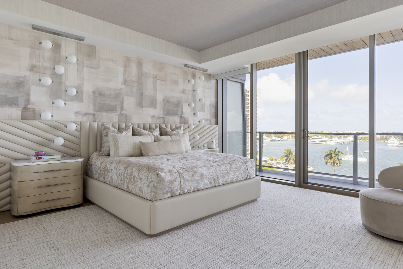
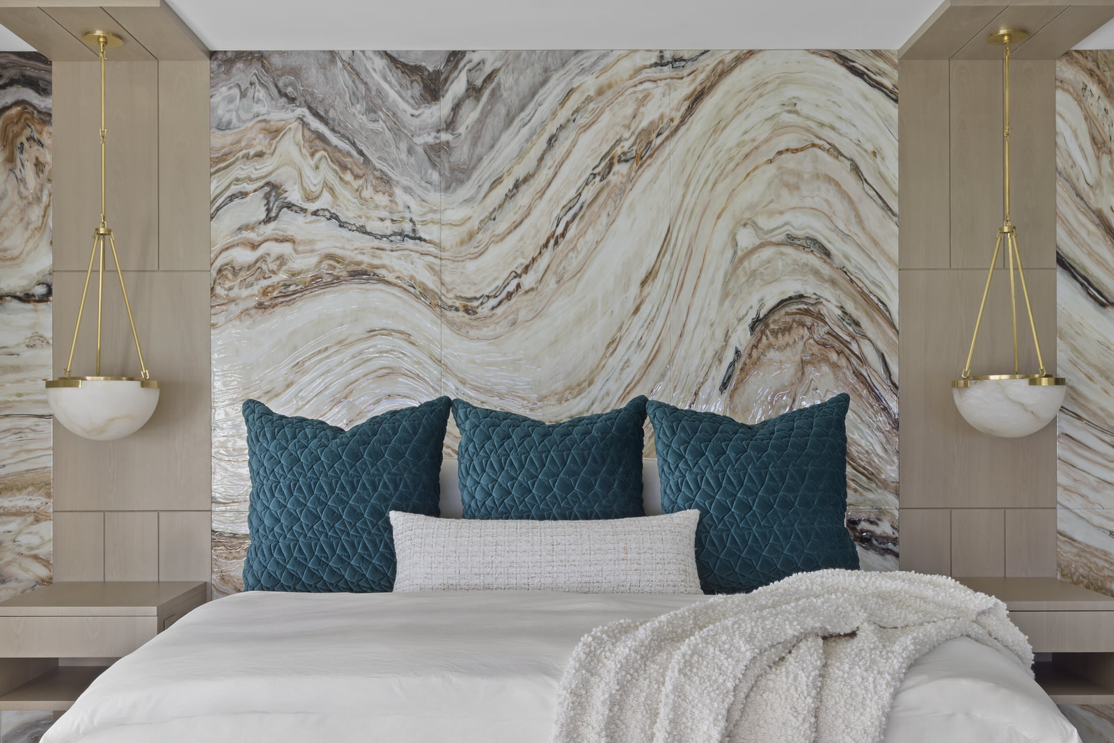
2. When everything is so busy it loses the point

If your eye doesn’t know where to land, it gives up.

We once walked into a home where every wall had a moment. Every light was a statement. Every rug had a personality. It felt like being yelled at from every direction.

Editing is not you holding back. It is you knowing when to stop.


3. Designing for photos, not for living

If it looks great but doesn’t work, it is a prop.

Homes should handle real life. Not abuse. Nothing can handle abuse. Nothing lasts forever. A little wear is normal. It means people actually live there.

We have seen kitchens that belong in a magazine and nowhere else. No prep space, no storage, just vibes. Stunning, until you try to make breakfast.

The goal is not untouchable. It is livable and still beautiful.


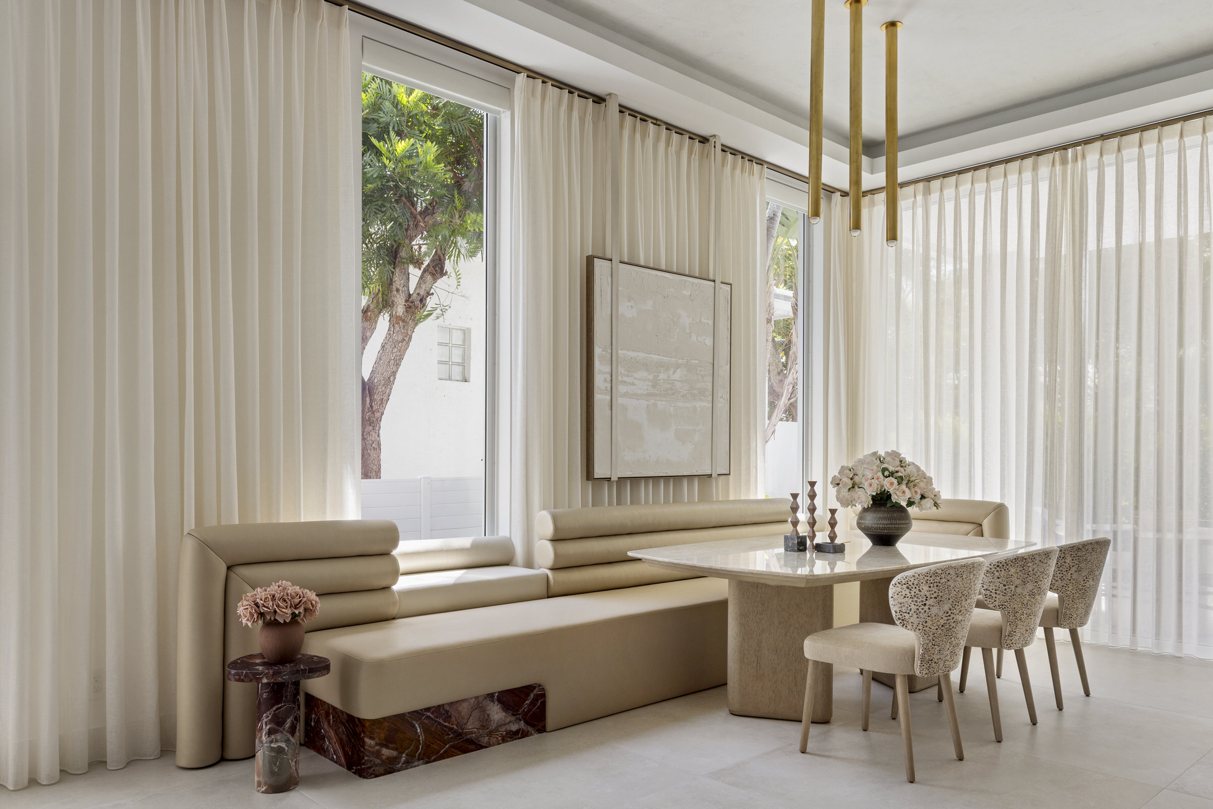
4. Repeating the same look over and over

If every project looks the same, it is not a signature. It is a copy paste.

It is lazy and a slap in the face to a client who is paying for a personalized process. The client deserves more. Their home should be 100 percent them, not a recycled version of someone else’s.

There are designers who stay in one lane and do it well. That works for some clients.

Our clients expect more.

If you look across our work, it is all over the place in the best way. Different tones, different moods, different directions. Still a clear point of view, still a vibe, just never the same answer twice.

We have clients show us inspiration all the time. The job is not to recreate it. The job is to understand why they love it and then do something better and specific to them.

You are not hiring a look. You are hiring thinking.


5. Not pushing beyond what the client asked for

Clients hire designers for perspective, not agreement.

If we are just nodding and delivering exactly what was asked for, something is off. The value is in showing what could be better.

At the same time, there is always that moment where a client is locked into an idea and you are trying to gently say there is a much better move here.

We have had to say, just trust this one thing. Those are usually the decisions that change everything.

No trust, no great design.


6. Design without a clear point of view

A home should have variety, but it should make sense.

This is the “I love everything” problem. Modern kitchen, coastal bedroom, traditional living room, a little glam powder room for fun. On paper it sounds great. In reality, it feels like four different houses sharing a zip code.

We had a project where the client loved very clean architecture and very soft, organic materials. That can go wrong fast. Instead of choosing one, we defined how they work together. Clean lines as the base, warmth layered in. It all spoke the same language, just with different accents.

If every room is trying to be the star, the house gets exhausting.

A clear story fixes that.


7. Playing it safe with color

I love color. I use color.

What I don’t love is fear disguised as sophistication. Entire homes washed out because no one wanted to take a chance.

At the same time, color is not easy. We have all seen what happens when it is used without control. Suddenly everything is competing and nothing feels grounded.

I am not convinced most designers know how to use color well, and that is part of the problem.

When it works, it elevates everything. When it doesn’t, everyone runs straight back to beige like it’s a safe house.


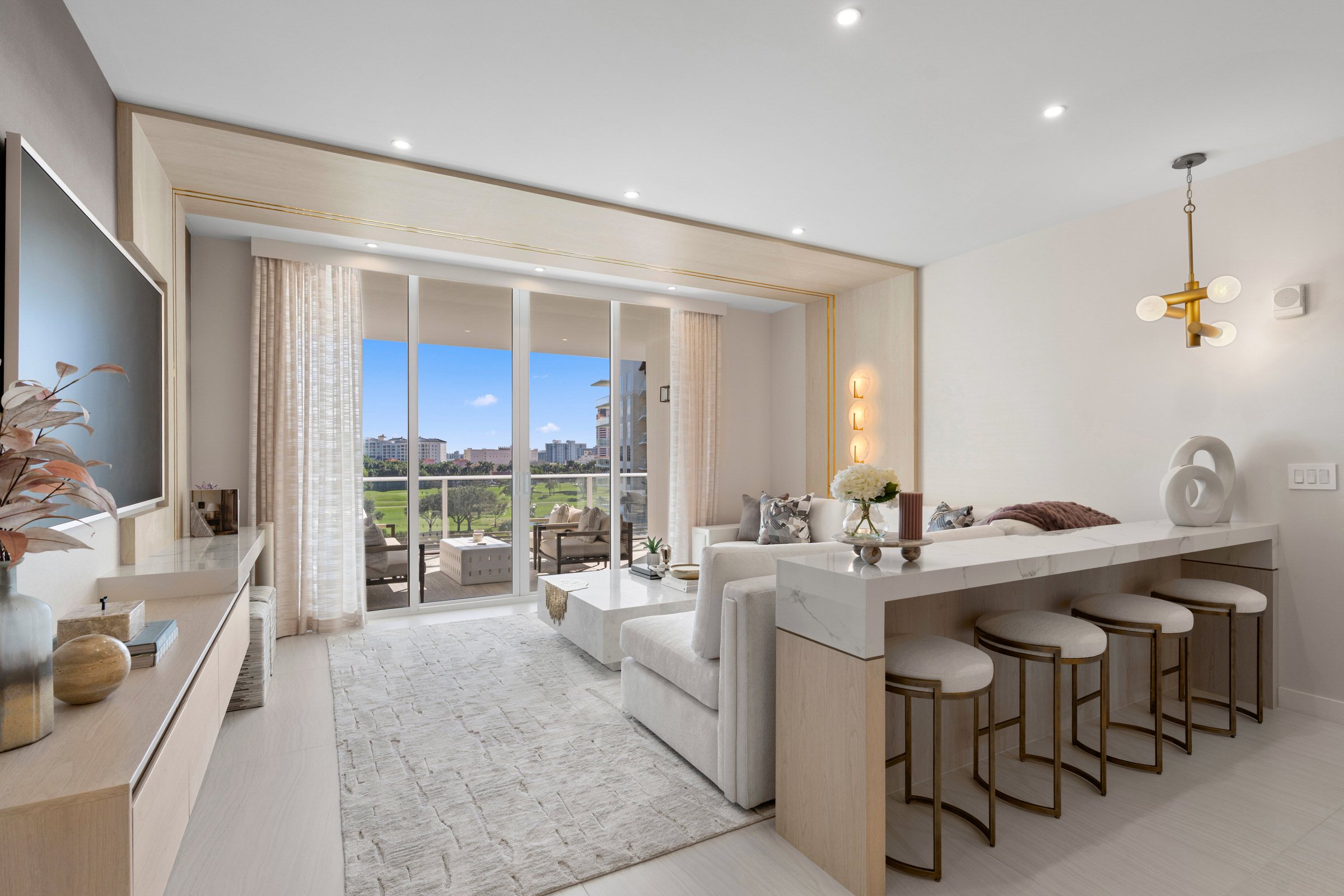
8. Wasted space and poor planning

This one hurts because it is so fixable.

Wasted corners, awkward layouts, hallways that go on forever for no reason. All of it comes from not thinking things through early enough.

We have pushed clients to move walls over inches. Inches. Not to spend more, but because those inches change how a room works. Suddenly a bed fits properly. Suddenly there is storage. Suddenly the room makes sense.

We are not pushing for more space. We are pushing for the right space.

There is a difference.


9. Thinking interior design has no real value

This one is always surprising.

Interior design is not just how something looks. It is how you move, how you feel, how your day runs without you even thinking about it.

We have seen homes where doors hit each other, kitchens don’t flow, and there is nowhere to put anything. You feel it every day.

There is psychology in this. Scale, light, layout, storage. All of it affects how you live.

Good design is doing a lot of work quietly.


And then there are the small things that drive me insane

The quiet offenders. The ones that don’t seem like a big deal until you live with them.

Switches in the wrong place
A bathroom with nowhere to put a towel
Beautiful stone with terrible seams
Lighting that makes everyone look tired
A sofa floating for no reason
Rugs that are too small
A kitchen with no landing space near appliances
Closets that look good and function terribly
Hardware that fights the door it is on
Millwork that almost aligns but doesn’t
Chairs that no one wants to sit in
Overhead lighting with no layering
And the big one
People who spend millions on a home and then slowly chip away at it with bad decisions

This is the part no one talks about. Design is not one big move. It is a thousand small ones.

Get those right, and everything feels easy.
Get them wrong, and you feel it every single day.

How Food and Design Interact (More Than You Think)

Food and design are not separate conversations.

They live in the same room.

At Nikki Levy Interiors, we don’t design kitchens as appliances and cabinetry. We design them as stages. For dinner parties. For homework at the island. For late-night tea. For holiday chaos. For Sunday morning pancakes.

Food shapes how a space is used — and design shapes how food is experienced.

Here’s how they constantly influence each other.


The Kitchen Is the New Living Room

For years, formal dining rooms sat untouched while everyone crowded into the kitchen.

Now? The kitchen is the living room.

Large islands become gathering tables. Upholstered counter stools matter. Lighting isn’t just functional — it sets mood. When we design a kitchen, we think about sightlines, seating depth, and how people lean, perch, spill, linger.

If food brings people together, design determines whether they stay.


Scale Changes the Energy of a Meal

A massive 12-foot island says: gather here.

A smaller, round breakfast table says: slow down.

Long rectangular dining tables feel celebratory. Round ones feel intimate. Banquettes pull conversations closer. Oversized pendants hung slightly lower create warmth.

The scale of a space changes the tone of the meal before a single plate hits the table.


Material Matters (More Than You Realize)

Marble feels cool and elegant.
White oak feels grounded and warm.
Polished brass catches candlelight.
Matte finishes absorb it.

Food is sensory — taste, smell, texture. Design should support that sensory experience, not compete with it.

We think about how a stone reflects under evening light. How a dark countertop makes white dishes pop. How textured plaster behind open shelving adds depth without overwhelming the eye.

The backdrop affects the entire experience.


Storage Shapes Lifestyle

Pantry design isn’t glamorous — but it changes everything.

A well-organized pantry encourages cooking. A beautiful bar area encourages hosting. A hidden appliance garage keeps counters calm.

Design quietly nudges behavior.

When everything has a place, the kitchen becomes usable, not just beautiful.


Dining Rooms Deserve a Comeback

There is something powerful about sitting at a proper table.

Layered lighting. Comfortable chairs. A rug that grounds the room. Art that sparks conversation.

Food tastes different when the space feels considered.

We design dining rooms to feel like experiences — not relics.


Outdoor Dining Is Design, Too

In warm climates, outdoor living is not an afterthought.

An umbrella for shade. Proper outdoor dinnerware. Comfortable lounge seating near the table. Lanterns for night.

Food doesn’t stop at the sliding door. Design shouldn’t either.


Design Creates Ritual

The coffee station you pass every morning.
The bar cart you roll out for guests.
The drawer that perfectly holds linens.

These small design decisions create rhythm.

And rhythm creates ritual.


The Real Intersection

Food brings people together.

Design determines how they feel while they’re together.

Are they relaxed?
Are they lingering?
Are they hosting more?
Are they proud of their space?

A kitchen isn’t just cabinetry. A dining room isn’t just a table.

When food and design work together, the home becomes more than beautiful.

It becomes alive.

10 Housewarming Gifts That Feel Thoughtful, Elevated, and Actually Special

When someone moves into a new home — whether it’s new construction, a renovation, or a long-awaited upgrade — this is not the moment for a generic candle.

A new home is a reset. New routines. New memories. New energy.

The best housewarming gifts elevate how they actually live — with kids, dogs, patios, dinner parties, and real life happening every day.

Here are 10 that feel considered, refined, and genuinely exciting to receive.


1. A Statement Coffee Table Book

Brand we love: Assouline

One oversized, beautiful book that anchors the table. Travel, fashion, architecture — something that reflects who they are or where they dream of going next.

It instantly makes a living room feel finished.


2. A Sculptural Bar Moment

Brands we love: AERIN, Georg Jensen

A stunning ice bucket. Elevated bar tools. Elegant coupes.

It says, “You’re hosting now.” Even if it’s just Friday night with family.


3. Elevated Outdoor Living Pieces

Brand we love: Business & Pleasure Co.

A striped umbrella. Chic outdoor pillows. Beautiful melamine dinnerware.

Outdoor space shouldn’t feel temporary. Help them use it beautifully from day one.


4. A Proper Dog Situation

Brand we love: Lords & Labradors

A tailored dog bed that blends into the interior. A refined leash. Elevated bowls.

Luxury living includes the four-legged family members.


5. Monogrammed Towels

Brand we love: Weezie

Oversized, plush, personalized bath or pool towels feel indulgent and practical at the same time.

It’s a daily luxury.


6. Linen Bedding from Boll & Branch (And Have the Bed Made)

Brand we love: Boll & Branch

Fresh, beautiful linen bedding is one of the most underrated luxuries.

And yes — have it delivered and the bed made for them.

Walking into a new house and seeing a perfectly dressed bed waiting? That’s peace.


7. A Kids’ Creative Corner Starter Kit

Give them a ready-made creative zone.

• A beautiful wooden easel
• Linen art smocks
• Quality paints and sketchbooks
• A giant roll of craft paper

It gives kids ownership of the new home — without sacrificing style.


8. A Private Chef Night in the New Kitchen

Skip the object. Give an experience.

Hire a private chef for their first dinner party in the new house. It celebrates the kitchen immediately and removes all stress.

That’s memorable.


9. A Backyard Movie Night Setup

Portable projector. Neutral floor cushions. Cozy throws. Popcorn bowls.

First movie night becomes a tradition instead of a someday idea.


10. A Custom Home Essentials Box

Curate it beautifully:

• A marble catchall tray for the entry
• High-end hand soap for every sink
• A chic lighter + candles
• A handwritten note

Thoughtful details make a house feel intentional instantly.


The Only Rule

If it feels like you grabbed it on the way, it’s not it.

The best housewarming gifts elevate everyday living, create a moment, or make the home feel finished from day one.

A new home is possibility.

Bring something that honors that.

FROM THE START

Nikki Levy Interiors wasn’t born out of struggle.

It was born out of courage.

Our life in South Africa was beautiful. Established. Comfortable. Surrounded by family and friends. We had community. We had rhythm. We had a full life.

And then Mike and I chose to leave it.

In 2010, we moved to the U.S. with a 7-week-old baby, a four-year-old, and a six-year-old. Three little kids. Big leap. The kind where you don’t fully let yourself think about what you’re giving up.

What people don’t always understand is this: when you move countries, your currency doesn’t magically follow you. Our rand did not translate kindly into dollars. What looked substantial at home became very modest here.

We didn’t arrive “starting fresh” in a romantic way.

We rebuilt from scratch.

New systems. New network. New reputation. New everything.

For the first few years, we focused on stabilizing our family. Learning how things work here. Figuring out schools. Finding our footing.

In 2013, I started Nikki Levy Interiors at my kitchen table.

It wasn’t about chasing design fame. It was about building security. Every client mattered because every project meant progress. Progress meant options. Options meant our children would grow up with opportunity.

Mike and I worked relentlessly. We put clients first. We reinvested in the business. We built systems slowly and carefully. We learned the financial side as seriously as the creative side because there was no room for casual mistakes.

One project became two. Two became referrals. Renovations became large-scale new construction. Bathrooms multiplied. Kitchens multiplied. Complexity grew.

And so did we.

What began as survival turned into strategy.
What began as rebuilding turned into growth.
What began as necessity became a studio known for layered, story-driven, exquisitely livable homes.

But underneath all of it is this truth:

We didn’t build Nikki Levy Interiors because we had to.
We built it because we chose to bet on ourselves.

And we did it together.

Where I Go to Find New Design

We work throughout South Florida, including Boca Raton, Palm Beach, and Wellington. While our projects live here, our ideas don’t come from staying local. To keep our work evolving, I go where design is being tested, discussed, and pushed forward – then translate those ideas back into our homes at Nikki Levy Interiors.

KBIS

KBIS is where innovation shows up first. Kitchens, baths, materials, systems – this is where you see how homes will function next. I attend to understand what’s coming, and I’m also there speaking on panels and working with brands, which gives insight into how products are developed before they reach the market.

What comes back with me is clarity, not trends, and that directly shapes how we design kitchens and baths for our clients.

High Point Market

High Point is about furniture, scale, and comfort. It’s where proportion becomes real and craftsmanship can’t hide. I go to train my eye and understand how pieces actually live in space.

Those lessons translate into rooms that feel balanced, comfortable, and intentional in South Florida homes.

Coverings

Coverings is a deep dive into tile, stone, and surfaces from around the world. It heavily influences how we think about floors, walls, kitchens, baths, and architectural moments.

We don’t replicate what we see – we refine it. Materials get edited and scaled so they feel right for our projects and our climate.

Design Edge

Design Edge is conversation-driven. It’s where designers and industry leaders talk openly about where design is going. I participate in panels because those discussions matter—they shape how we think creatively and strategically.

Beyond the fairs and forums, we travel widely—from Europe to the Middle East to the Americas—and we spend time at the New York Design Center, where global design is distilled at the highest level. Architecture, materials, craftsmanship, and how people truly live with design all plant inspiration that’s subtle but lasting, shaping homes that feel considered, worldly, and still deeply rooted in South Florida.

Why This Matters

Our work is local, but our perspective is broad. By seeing what’s happening beyond our immediate market, we bring a more informed, thoughtful approach back into every project.

That’s how ideas become interiors – and why our work continues to evolve.

Measurement rules to follow…and break

Good design isn’t about following rules. It’s about understanding them well enough to use—or ignore—them with confidence. Measurements give a room structure. Instinct gives it character. The best spaces have both.

Rugs (Start Here)

If there’s one place designers consistently go wrong, it’s rug size.

  • Best case: all furniture sits fully on the rug. This creates a grounded, finished room and makes everything feel intentional.
  • Next best: at least the front legs of all seating are on the rug.

An undersized rug breaks a room instantly. Oversized rugs don’t overwhelm—they calm.

Seating + Tables

  • Sofa to coffee table: about 16–18 inches. Close enough to use comfortably, far enough to move easily.
  • Chair to side table: within easy reach. If you have to lean or stretch, it’s wrong.

These distances aren’t about math—they’re about comfort.

Dining Rooms

  • Clearance around the table: 36–48 inches. This allows chairs to slide out and people to walk behind them without friction.
  • Chandelier height: roughly 30–34 inches above the tabletop, unless the scale of the room says otherwise.

Bedrooms

  • Clearance around the bed: about 30 inches minimum. More if the room allows.
  • Nightstand height: within a few inches of the mattress height. This is one of those details you feel immediately if it’s wrong.

Art (This Is the One People Ask About)

  • Art center: roughly 57–60 inches from the floor, measured to the center of the artwork. This is standard eye level and a solid starting point.

Then we adjust. Over furniture, the relationship to what’s below often matters more than the number. With large-scale art, stacked pieces, or gallery walls, we align the center of the overall composition. In rooms with high ceilings, art often comes down lower so it feels connected, not floating.

Lighting

  • Table lamps: the bottom of the shade should sit around eye level when seated.
  • Pendants over islands: typically 30–36 inches above the counter.
  • General rule: if you’re debating between two sizes, the larger one usually wins.

The Real Rule

Measurements are not laws. They’re tools. Some of the most memorable rooms come from breaking them on purpose—overscaled art, generous rugs, furniture that pushes proportion just enough to feel bold.

Measurements create balance.
Artistic choice creates impact.
Good design knows when to use each.

SCALE SCALE AND MORE SCALE – the how to guide

Start with the Architecture

Ceiling height, window size, door scale, wall width. These are your non-negotiables. A room with high ceilings needs visual weight. Small furniture floating in a tall room will always look lost, no matter how pretty it is.

Furniture Should Match the Room, Not the Catalog

That sofa you loved in the showroom might be too delicate at home. Large rooms need pieces with presence—deeper sofas, wider chairs, substantial tables. Small rooms need restraint, not miniatures. Underscaled furniture makes a room feel unfinished.

Rugs Do the Heavy Lifting

A rug that’s too small shrinks a room instantly. The rug should anchor the furniture, not sit under it like an afterthought. If the furniture isn’t at least partially on the rug, the scale is wrong.

Art Is Not an Afterthought

Tiny art on a big wall is one of the fastest ways to make a room feel off. Large walls need confidence—oversized art, pairs, or well-planned groupings. Art should hold its own against the furniture and architecture.

Lighting Sets the Tone

A small light fixture in a large space feels apologetic. Go bigger than you think—especially with pendants and chandeliers. Lighting is one of the easiest ways to correct scale without changing the entire room.

Negative Space Matters

Not every inch needs to be filled. Proper scale includes breathing room. Letting furniture sit comfortably within the space allows the room to feel intentional rather than crowded or sparse.

The Rule We Actually Follow

If it looks a little too big on paper, it’s probably right in real life.

Scaling a room is about confidence, not caution. When the proportions are right, the room feels calm, balanced, and effortless—and you don’t have to explain why it works. It just does.

Palm Beach and Boca Different energy. Same sun. No rule-following.

Palm Beach has a sweetness to it. Layered patterns, florals, color, rattan, woven materials. Rooms feel collected, happy, and soft around the edges. There’s tradition there, but it’s not stiff. It’s charming, confident, and full of detail.

Boca is cleaner and more relaxed. Open, modern, easy. The focus is on flow, comfort, and how people actually live. Less decoration, more breathing room. It’s polished without feeling precious.

And then there’s how we design.

We don’t play by the rules of either place. As a firm that sets trends rather than follows them, we take the essence of Palm Beach or Boca and tweak it. We push it. We layer it differently. We mix what “shouldn’t” go together and make it feel obvious once it’s done.

Our Palm Beach projects still have sweetness—but with unexpected choices, bolder moments, and a point of view. Our Boca projects stay relaxed—but with depth, texture, and personality you don’t see everywhere else.

We respect place. We respect architecture.
But we don’t copy what’s already been done.

That’s what makes the work feel special.
And why no two of our homes ever look the same.

The Diane Keaton Effect: Movie Homes That Redefined American Design

Some people watch movies for the plot. I watch them for the sconces and kitchen layouts. Diane Keaton has starred in some of the most beautifully designed interiors in film; not just nice sets, but homes that shaped the way people began thinking about design. In many ways, her movies helped move American residential interiors toward the warm, coastal, lived-in look we still reference today. These weren’t movie sets. They were feelings.

Father of the Bride is the classic example. That house was the dream: traditional, layered, warm, full of personal detail. Nothing flashy. The architecture did most of the work; symmetrical facade, paned windows, brick path to the front door. It was the kind of house you imagined growing up in. Interiors were soft and collected. Botanical art, wood floors, built-ins, family photographs. It looked like a real home, not a styled one, and that’s why people loved it. To this day, clients still reference that house. You remember the basketball court, the backyard tent, the gentle lighting in the dining room. It was comfortable design with heart.

Then came Something’s Gotta Give, which might be the most talked-about movie house in modern film history. That Hamptons beach house shaped entire design trends. White slipcovered sofas, stripes, open floor plan, blue-and-white palette, books everywhere, natural light for days. The kitchen became iconic; spacious, classic, functional, with pendant lighting and that oversized island everyone remembers. The whole space said “I can write and cook and think and entertain in this house.” And people felt that. Designers began getting the same request over and over: I want the Something’s Gotta Give house. It made coastal design smarter. Less seashells, more structure.

It’s Complicated followed with a different energy; still warm, but with deeper tones and a more European, collected feel. Arches, aged wood, layered fabrics, terracotta, worn stone. The kitchen struck a chord again; not perfect, but personal. The house had history and humor. It was one of the first times we saw a space that felt comfortable and adult at the same time. Nothing sterile. Nothing overdone. It changed the conversation about what “California style” could look like.

Other films followed the same thread. The Family Stone offered a messy, beautiful, lived-in family home that felt real. Marvin’s Room had a quiet simplicity; raw, emotional, with softer colors and natural light that carried more meaning. Book Club leaned into a more elevated, refined look but still kept warmth in the palette; white walls, curated objects, strong furnishings. Even the sets we see for Diane Keaton today; including her real-life home featured in “The House That Pinterest Built”; continue to prove the same point: her world is designed, but it isn’t contrived.

What ties these interiors together is personality. The spaces aren’t perfect. They’re lived. They have books, layers, evidence of life. They mix upscale with comfortable. They use materials you want to touch. They frame lighting carefully. They hold memories. They don’t stage a life, they suggest one.

As designers, we can learn a lot from these films. Narrative and layout go hand in hand. Rooms don’t have to be loud to be strong. The kitchen can tell the story just as well as dialogue. And the best homes are the ones that feel like someone truly lives there.

Diane Keaton may be known for her roles, but in the world of design, she quietly became one of the best references for how a home should feel. Warm. thoughtful. layered. and unapologetically personal.

I’ll take that over a perfect ending any day.

The Details That Make a Room Feel Designed—Not Decorated

A space doesn’t feel special because it’s full. It feels special because it’s considered. There’s a difference between decorating and designing, and clients feel that difference the moment they walk in.

Color drenching is one of the fastest ways to change the mood of a room. One tone across walls, trim, doors — it wraps you. It pulls the eye inward and makes the room feel resolved. It doesn’t have to be loud. A soft clay tone or a muted green can do more than a busy palette ever will.

Wallpaper is my forever obsession. It can hold a room together without needing a single piece of art. It gives a space its own personality — sometimes quietly, sometimes boldly — but it always gives something back. I don’t believe wallpaper should cover space. It should carry space.

Molding is like the detail work on a couture dress — invisible to some, but everything to the people who notice. It changes the structure of a room. It gives it a frame. You don’t always point to it, but you feel when it’s done right — it’s what makes a room feel complete.

Personal accessories add life, not clutter. A book actually read. A ceramic piece brought back from travel. A framed note. These things carry presence. They don’t fill space — they claim it. When I’m working on a home in Boca Raton, Delray, or West Palm Beach, this is always the last layer, and it’s usually the one the client connects to the most.

Custom rugs settle a room. They define scale and anchor the layout. We design rugs often at Nikki Levy Interiors, because “almost right” sizing never works. When the rug is customized, the entire room finds its rhythm.

Lighting sets the temperature of a space. One lamp can soften a room instantly. A strong fixture can anchor the whole design. Layers of light can shift mood without changing a single piece of furniture. Lighting is not about brightness. It’s about intention.

Sometimes a space needs a hero piece — one item that creates direction for everything else. It might be a vintage chair, a custom table, a sculptural console, or a piece of art that tilts the energy just slightly. Design doesn’t always start with paint or tile. It often starts with the one thing that feels inevitable.

And every so often, a room deserves a single unapologetic choice — the total I don’t care, I love it moment. The “one total screw-you piece.” It might be scale, material, color, lighting — but it shifts the energy and wakes up the space. Not decorative. Not safe. Honest.

Collections give history. Galleries give perspective. Art, pottery, sculpture, textiles — when displayed with intention, they tell a story about the person who lives there. A home in West Palm Beach or Delray can hold the same visual sophistication you’d expect in Paris or London — as long as it’s curated, not copied.

At Nikki Levy Interiors, every space is approached the same way: design should feel personal. It should feel lived, not staged. A room becomes special when it carries the life of the person it belongs to — and when the details are done with care.